2 killer tricks for unifying photo composites in Photoshop
Sep 10, 2022Getting a realistic composite image in Photoshop can seem super complicated.
What most people don’t know is that there are a handful of really useful, repeatable tricks I rely on every time that are dead-simple for bringing the image together. And I get to kick back and be creative!
In my previous blog post, I talked about Specular Matching, which is a really powerful finishing trick I cover in my Overlay Brush Workflow course. Here I’ll lay out two more fancy methods I use to unify my photo composites using a couple of pretty simple Photoshop workflows.
My 80/20 Rule for Creativity.
You may have heard of the 80/20 rule in regard to things like productivity or revenue, but I have a custom variation of it that I use whenever I’m doing creative photo compositing in Photoshop.
We all know how technically complex Photoshop can feel sometimes. And that’s a big problem when it comes to creativity - we can’t have our brains occupied with technical, cognitive stress and still be creative. It’s pretty well documented.
In creative exploration, I always focus on the 80% of work that gets me interesting, cool, weird, or surprising results first. That means moving quickly and exploring options. The 20%, which is comprised of the technical, comes later - those are repeatable steps I shouldn’t be worried about when I’m creating.
The 20% may achieve creative outcomes, but they aren’t exploration. I use them every time and they don’t require energy.
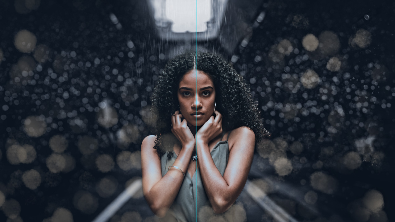
Photo Compositing, Collage, Blending, whatever - just have fun!
Photo compositing should be fun. That might sound cute, but for real - it’s pretty much the coolest thing to use Photoshop for.
Fun for me is moving quickly and exploring options, being playful essentially; my experience allows me to relax because I know at the end I’m going to do a few things that always bring the image together.
The unified image - color and contrast essentials.
One technique I show in my Overlay Brush Workflow course is my method for adding “Punch” to images. It can be used on a standalone photo, but it works great also as a tool for unifying composite images.
There are a few steps to it (I use an action, which is included in my course downloads) that involve “stamping up” all the visible layers, setting the blend mode to Overlay or one of the Overlay blend modes, and applying High Pass. It’s pretty simple.
A quick Photoshop primer - High Pass and Overlay (TL;DR? Skip it - only for the nerds).
Photoshop’s High Pass Filter is a relatively obscure one that’s good for all sorts of stuff, but mainly it creates halos - essentially it turns your image to grayscale and wherever there are areas of contrast, it mathematically darkens the darks and lightens the lights according to the radius you use.
Overlay is a blend mode that says “Blend this layer into the ones below it, but anything 50% gray has no effect, anything darker than 50% darkens the underlying layers, anything brighter than 50% brightens.”
High Passing to Harmony - Unifying Contrast.
Combine Overlay Blend Mode with High Pass, especially at higher values, and you get a big old contrast punch to your photo.
But more importantly in photo composites, the result of stamping and applying it across the board to all the disparate elements you put together is, you guessed it - a freakin’ Photoshop kumbaya moment.
The Photo Filter adjustment layer, seriously?!
Seriously. It’s my third fancy trick.
I’ve literally had a colleague laugh at me for saying I use the Photo Filter. Some high-snobiety retouchers look down their nose at it, they see it as a child’s toy. And my response? “I don’t care, please refer to my portfolio. See all that stuff? Yeah, Lebron himself approved that and it had a Photo Filter on it.”
It is quite simple, it’s a blunt-force instrument. And that’s why I love it.

Popping a simple Photo Filter adjustment layer on top of your layer stack is a two-second trip to harmony-town. You just decide whether it’s going to be warm or cool, and adjust the strength to the desired effect.
The result is a subtle, unifying hue throughout all the elements of your composite. And the human eye has a tendency to sort of normalize continuous color casts in images. A slight warm hue throughout a photo will quickly be auto-white-balanced by our visual system.
The photo composite big 3 for the finish!
That’s it, Specular Matching, Punch, and a Photo Filter layer. If you always have those in your back pocket for the finish, you can spend so much less time finessing every single element individually. And less time stressing about “Is this going to work?!” because you always have your trusty arsenal of finish tricks.
If you like these solutions, you’ll definitely like my course Photoshop Creative Effects: The Overlay Brush Workflow. It’s about some really cool particle brushes I’ve been working with, but more importantly it’s about the workflows around them and the mindset for creativity.
Lemme know in the comments what you think, and if you have any cool photo composite unifying tricks!
Thanks!
-Sef

